05/03/2022 - 17/05/2022 / Week 6 - Week 8
Tay Yee Shien / 0341472
Typography / Bachelor of Mass Communication (Hons)
Task 2 / Typographic Exploration and Communication
LECTURES
Week 5 - UNDERSTANDING LETTERFORMS
1. Understanding Letterforms
Uppercase letters are not symmetrical. For instance,
the serifs and stem in the letter A in Baskerville have different arcs. There
are many details in the typeface that type designers create.
2.
Maintaining X-heights
Curved strokes like the letter ‘S’ usually
exceed the median or the baseline a little bit so that they could look the same
in size as the other alphabets.
3. Form / Counterform
Type
designers should pay close attention to detail to understand the form and
counterform of a letterform to be able to gauge a sense of balance between them.
4. Contrast
We can apply contrast in creating types.
WEEK 6 - SCREEN AND PRINT
1. Print vs. ScreenType for Print
Designers must make sure that the text is smooth, flowing, and pleasant to read. Common typefaces used for print include Garamond, Baskerville, and Caslon as they appear elegant, intellectual, and highly readable when set at small font sizes. Type for Screen
The modifications in screen type as compared to print type may include a taller x-height, wider letterforms, more open counters, heavier thin strokes and serifs, reducing stroke contrast, and modified curves, and angles. There are also some types that are designed specifically for screens.Hyperactive Link/Hyperlink
When the cursor is moved over a hyperlink, the arrow should change to a small pointing hand.Font Size for Screen
The size of a screen is usually 16 px, which is equivalent to 12 pt in books (reading at arm’s length).System Fonts for Screen/Web Safe Fonts
Open Sans, Lato, Arial, Helvetica, Times New Roman, Times, Courier New, Courier, Verdana, Georgia, Palatino, Garamond. Pixel Differential between Devices
The text on different screens such as PCs, phones, and TVs differ in proportions because they have different sized pixels. 2. Static vs. MotionStatic typography
It has minimal characteristics in expressing words such as bold and italic. Motion typography
More expressive and is often used in music videos and advertisements. It has motion to it following the rhythm of the music. E.g. Motion graphics.
WEEK 7
All lectures are completed from Week 1 to Week 6. |
INSTRUCTIONS
TASK 2: TYPOGRAPHIC EXPLORATION AND COMMUNICATION
We are required to create a two-page editorial spread using one of the three texts provided by Mr. Vinod. We should use our past knowledge from the previous assignment and improve on them to complete this task. We can use Adobe Illustrator to create the heading, however, the text formatting should be done on Adobe InDesign.
TASK 2 NOTES
- Understand the content of the text
- Create sketches and experiment with different layouts
- Block out the text with boxes to grasp the balance of negative space and the grey area in the layout.
I went on to Pinterest to do some visual research. I find that it gives me the boost of inspiration and aspiration to create something that might inspire others as well.
fig. 1.0 Typography Poster (08/05/22)
I find the headline really interesting and eye-catchy.
fig. 1.1 Body text inspiration (08/05/22)
I like how the quote is big and in the middle of the two columns. It's also interesting how one column of text is higher than the other.
fig. 1.2 Editorial spread example (08/05/22)
This editorial spread looks pleasing overall. Simple and neat.
SKETCHES
After reading the three articles provided and experimenting with the headlines through rough drafts, I chose to work with “Follow the Code.” For the heading, I tried to design it in a way that the eyes of the viewers “follow” the text/alphabets as they read.
fig 1.3 Rough Drafts. (09/05/22)
I experimented with different layouts for the three headlines.
fig. 1.4 Sketches for “Follow the Code.” (09/05/22)
These are very rough sketches and I further developed them as I moved along to the digitalisation stage.
DIGITALISATION
I did the headings and text formatting on Adobe InDesign. For the headings, I covered the word “Follow” with white boxes to create an optical illusion. Even the whole word is not presented properly. Viewers can still “follow” the alphabets to guess the complete word.
fig. 1.5 Attempt 1 for the heading. (11/05/22)
I think it is not easy for viewers to guess that the word I am trying to emphasise is "Follow."
fig. 1.6 Attempt 2 for the heading. (11/05/22)
Afterward, I experimented
with a different layout for the heading.
fig. 1.7 Attempt 3 for the heading and body text. (11/05/22)
I tried not to cover the heading “FOLLOW” to see what it’d look like. I also placed the body text in a staircase structure so the readers can read from the lower “stair” to the higher “stair.”
fig. 1.8 Attempt 4 for the heading and body text. (12/05/22)
I amended the letterforms from Attempt #1 so that we can see each alphabet more. Overall, I prefer the design of Attempt #4 because the letterforms of the headings looked unique and well-aligned. As for the body text, the columns go higher and higher as it goes to follow a visual hierarchy.
Final Submission: Task 2 - Typographic Exploration and Communication
fig. 1.9 A screenshot of the final outcome of Task 2: Typographic Exploration and Communication with grids (PDF). (13/05/2022)
fig. 1.10 Final submission for Task 2: Typographic Exploration and Communication (JPEG). (13/05/2022)
fig. 1.11 Final submission for Task 2: Typographic Exploration and Communication (PDF). (13/05/2022)
DETAILS
Heading
Font: Gill Sans MT
Typeface: Regular (FOLLOW), Bold (FOLLOW THE CODE.)
Font size: 130 pt (FOLLOW), 8 pt (FOLLOW THE CODE.)
Body Text
Font: Univers LT Std
Typeface: 65 Bold (Subheadings), 45 Light (Body Text)
Font size: 8 pt
Leading: 10 pt
Paragraph Spacing: 10 pt
Average characters per line: 59 characters
Alignment: Left Justified
Margins: 12.7 mm (top and bottom), 12.7 mm (left and right)
Columns: 4
Gutter (for columns): 5 mm
Week 6
Specific Feedback: No feedback due to Hari Raya public holiday.
General Feedback: No feedback due to Hari Raya public holiday.
Week 7
Specific Feedback: No feedback due to me being absent in class.
General Feedback: Mr. Vinod encouraged us to get our work done earlier so that we could move on to the next assignment.
Experience:
The lectures and assignment briefs were straight to the point and clear. Mr. Vinod is always helpful whenever we had any doubts. During class, I am anxious that I am not able to get my work done but I always work hard to get the outcome out in the end. However, if I continue to work in this manner, I may experience burnout in the future and it is not good for my mental health. Thus, I need to work on the assignments as soon as it is brief so I can stay productive while getting the task done.
Observation:
I observed that I can produce better work after reviewing other’s and looking up on Pinterest for ideas and develop from there. If I were to produce something from scratch it would not be as good as the ones after I did my research. I believe that a design is rarely original but inspired by other people’s works. I also observed that I need to work on my time management. With proper scheduling, I can finish my work on time and take care of my mental and physical health.
Findings:
I found that I need to improve in creating more experiments in my work. Knowing this, I need to try to create more and more designs. Looking at the work of my friends has helped me improve as they are very talented designers. Even though I was not very happy with my first attempt, I like my final outcome. My brother even told me that it looked like the ones that came from a fashion magazine. I felt happy.
FURTHER READING
fig. 2.0 Typographic design: Form and communication by Rob Carter, Sandra Maxa, Mark Sanders, Philip B. Meggs, and Ben Day.
fig. 2.1 Chapter 7: The Evolution of Typographic Technology: Screen-Based Typography, page 132
Chapter 7 covers The Evolution of Typographic Technology. It stated that on-screen design and typography “respond” to the screen size they are being viewed on. The content is fit into the frame for each device. The benefit of this technique is that a single code base is used for all display sizes, thus simplifying the coding, and unifying the design from device to device.
.png)
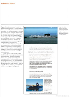
fig. 2.2 Chapter 8: Typography on Screen: Reading on Screen, page 137
This part of the book taught me that readers of on-screen text pre-read the page they are on. The quick view, length, relevance, and hierarchy are understood, and this helps the readers choose whether to read the whole article or not. A variety of units, rules, images, and dynamic variations in white space help readers mark their pace in the body of text. When designers provide these types of visual breaks, readers can stop, and restart reading or return to a specific place.
Reference:
Carter, R., Day, B., Meggs, P. B., Maxa, S., & Sanders, M. (2015). Typographic design: Form and communication. Hoboken, New Jersey: John Wiley & Sons, Inc.
.png)


.jpg)

.jpeg)


.png)
.png)
.png)

Comments
Post a Comment