Design Principles | Exercises & Projects (Weekly & Final Compilation)

----------------------------------------------------------------------------------------------------------------------------
INSTRUCTION
---------------------------------------------------------------------------------------------------------------------------
💬 Week 11-14 [01.11.2021 - 26.11.2021]: Final Project - Visual Analysis and Final Blog


Ms. Jinchi suggested I take note of how I use colours and suitable type to bring out my interpretation of hopelessness as I was going with the idea of using “hopeless” as my main theme.


This is how it turned out.
FEEDBACK FROM LECTURER 4


I’ve also redraw a black and white version to test out a different variation of color.

I redid the multicolored one again because I felt like the previous one looked messy. I switched for a simpler plastic wrap texture and added grain as well as paper texture to the black background. It seems contradictory to see that “HOPELESS” can be associated with bright colours, that is why I added the quote “THERE’S A HOPE THAT’S WAITING FOR YOU IN THE DARK” to show that there is light in the darkness and that there is a way out. I’ve also added my name, date, and title of the work at the bottom of the design.


---------------------------------------------------------------------------------------------------------------------------
💬 Week 9-10 [18.10.2021 - 30.10.2021]: Project 2 - Sense of Place


• Island Bazaar’s Instagram posts are just an example of how a sense of place can be expressed –photography. There are other mediums you can explore, such as collage, illustration (manual/digital), scale model, the possibilities out there are endless!
 Figure 1.7 My Mindmap about the Beach
RECAP OF PROJECT 2 BRIEFI am required to utilise and apply the design principles I have learned to date in order to express a location of their choice. The place becomes the subject of the composition in which the design principles are applied to capture the social and environmental aspects and even the time/s effects that will best express their intention/interpretation for a particular location. This requires me to move beyond the classroom to the outer world and to employ their skills in capturing and communicating a complex relationship.
Observe your surroundings – people, vehicles, buildings, plants, signages, nature, activities. Record these in sketches, photography, and/or video recording. Study all the visuals that you had collected. Select visuals that I find relevant and interesting to you, which you can translate into a design work that reflects your interpretation of a place.
For materials, I may use any of my choices, but do consider their suitability to best express your idea.
VISUAL RESEARCH When my friend asks me, “Where would you like to go when the pandemic is over?” I think about the beach, the smell of the cool ocean breeze, and the soft rushing water beneath my feet. There is a sense of peace, a different kind of peace from staying in my bedroom listening to music. Figure 2.1 Beach Inspiration 1
I like how this is simple and straightforward. It makes me want to walk right into the beach and feel the sand beneath my feet and also feet the ocean water.
 Figure 2.2 Beach Inspiration 2
I think this is a fun illustration because there are a lot of people hanging out and having a good time at the beach.
 Figure 2.3 Beach Inspiration 3
This looks a bit simple, but the colours look calming, and the water looks so serene. It brings a very nice mood to the beach.
IDEA EXPLORATION AND DESCRIPTION 1
 Figure 3.1 Drafts
TOP LEFT: It is pattern focused and there will be gradient colours of the ocean and sand. There is a little boat on the beach. BOTTOM LEFT: It’s a scenery of the beach from a human-eye level view. It also has mountains over the horizon.BOTTOM RIGHT: This is the view of the beach from a bird’s eye view. We can see the ocean water and some fun activities to do at the beach.
FEEDBACK FROM LECTURER 1
 Figure 3.2 Feedback
Ms.Jinchi thinks the "ocean" sketch has an interesting composition. It's like a pattern itself when seen at that angle (top view). She asks me to try combining the topmost idea (water-sand sketch) into the ocean area.
IDEA EXPLORATION AND DESCRIPTION 2
 Figure 4.1 Wave and sand patterns with colour palette
I drew curvy lines using the pen tool and chose a contrasting colour palette of peach, brown, green, and blue colours.
Figure 4.2 Beach props
Then I drew some umbrellas, mats, and sandals from birds eye view to put on the beach.
 Figure 4.3 Colouring process
Next, I started colouring my wave and sand patterns. Here I made a mistake because I did not remove the stroke colour of the lines, so when I removed it, there was a cast of a white line. Then I decided to redo the colouring after removing the black lines and with path only so it will look better.
 Figure 4.4 Finished colouring
After adding the colours, I used the blending tool to add 3 specified steps between each line. Then, it will create more detailed gradients of colours. Some lines were not suitable to be blended but it looks fine as well.
 Figure 4.5 The beach
Then I rotated the artwork to landscape mode and added my beach props. I also added some surfboards and a beach ball. I edited the colours of the props so they would blend well together with the beach as well. I also applied a gradient to the whole artwork so there would be a little shadow effect on the sides.
FEEDBACK FROM LECTURER 2Ms. Jinchi commented that the texture for the water is suitable and asked me to experiment with a vertical composition (rotate) to see if it will look better.

Figure 4.6 Final Outcome
I applied Ms. Jinchi’s feedback to my work, and I think it looks better than my previous version. I think it looks less basic and a little more artistic. A bit like an airplane view when flying over a beach.
FINAL OUTCOME AND BRIEF RATIONALE
This is the view of the beach of how I imagine it inside my head but in a dream-like way. I miss traveling with my cousins and the feeling of being able to unplug from studies and everyday problems. It is difficult to find ways to get away for some time to refresh ourselves due to the pandemic. Sometimes staying at home all the time can bring detrimental effects on ourselves, whether it be physical injuries like getting foot pain from walking around the house barefoot all the time or not being able to find the right words to speak again. So, this artwork is the place I want to be in at the moment, but I can't, and that’s okay. All in all, the artwork leaves a bittersweet feeling that represents the freedom of travel in the past and also longing for future celebrations.
REFLECTIONNot only this assignment, but this whole module has given me an outlet to express my feelings and emotions. Project 2 allowed me to draw the place I wish to see. I would say it is less complex than the previous assignment as for the previous one, I need to do some soul searching and find myself. For Sense of Place, I am more direct as I know what I want and where I want to go. I love how the colour palette turned out and how smooth the beach looks. I can really imagine going there and having a fun time with my cousins. For now, I just picture it with my drawing first and make plans for the future once the pandemic improves.

----------------------------------------------------------------------------------------------------------------------------
💬 Week 6-8 [27.09.2021 - 11.10.2021]: Project 1 - Self-Portrait
The self includes my thoughts, experiences, interests and how others and I see myself (physical traits and personality). Asking the question “What defines ME?” helps to reflect on oneself.
SELF-PORTRAITA self-representation in the form of a drawing/painting/sculpture/design. It is a visual depiction of the self. A self-portrait artwork represents the designer/artist—in other words, how he sees himself, what he’s feeling, and how he wants to be seen by others. It’s not necessarily about creating a realistic image of yourself; instead, it’s often an exercise in self-exploration.
EXAMPLES OF FAMOUS SELF POTRAITS

Figure 1.1 LEONARDO DA VINCI
For Project 1: Self Portrait, I need to create a portrait of myself by applying the various principles that I learned through these weeks.
I can explore the historical and contemporary forms of self-expression and also review the design principles covered and thus better inform their particular direction. I can also make use of any media to create the work. I must explore a range of possibilities to better determine an outcome through the critiques either individually with the teachers, selected students, or with the class as a whole. I am also are encouraged to look at the work of other designers and artists.
While I am progressing, I need to share my work with my lecturer for feedback. I shall contemplate my life experiences, including my culture, family, friends, schooldays, favorite hangouts, favorite music, food, musician, etc. I shall observe my surroundings – people, vehicles, buildings, plants, signages, nature, and activities. Record these in sketches, photography, and/or video recording. After collecting and studying all the visuals, I must select what I find relevant and interesting, which I can translate into a design work to create a portrait of myself.
A self-representation in the form of a drawing/painting/sculpture/design. It is a visual depiction of the self. A self-portrait artwork represents the designer/artist—in other words, how he sees himself, what he’s feeling, and how he wants to be seen by others. It’s not necessarily about creating a realistic image of yourself; instead, it’s often an exercise in self-exploration.

VISUAL RESEARCH 1


Figure 2.1 Double Exposure Ideas
LEFT: This is a cartoon of an elderly man with double exposure to peaceful autumn scenery. I like how it relates to the feeling of the man and brings out a sense of peace. I also like how this double exposure combines the cartoon of a person instead of using a real person photograph often seen on Pinterest.
RIGHT: I like how this idea is polaroid, but there is double exposure applied to it. It can be used to show two sides of a person as in the example above: joyful and serious. If I were to create double exposure, I would apply themes like me in high school vs. me in university, or pictures of me as a child, teenager, and young adult, or I could showcase my good side vs. my bad habits.

 Figure 2.2 Collage Ideas
LEFT: This is a collage of Jimin from BTS. It combines different parts of him from other pictures into one. This gave me an idea of how I can showcase a variety of moments in my university life that made me happy, sad, worried, scared, etc. It can also be a compilation of moments in my life where I felt at my highest or lowest.
RIGHT: This digital collage has American rapper, Kendrick Lamar as the main character, and all the details around him talk about racism and rough things that black people have to go through. It illustrates unfair treatment by the police, being sent to prison often, and news about American minister, Dr. Martin Luther King Jr. being assassinated. I felt the artwork was deep. I can create a digital collage to talk about my life growing up in Indonesia and/or also my university city in Malaysia.
FEEDBACK FROM LECTURER 1Ms. Jinchi mentioned that even though sometimes it is good to be self-directed (knowing what we already want), it's also good to explore more. She said that the most important thing is to choose what I want to do to reflect on myself. She advised me to search for visual examples that I can relate to in terms of content, not just how they are finished. By the end of the day, it comes back to me how I would like to express myself in a visual form.


VISUAL RESEARCH 2
 Figure 3.1 Scrapbook Collage
Then I decided to go for a scrapbook collage-style because I want to showcase the things I went through in my life through pictures. I got enough photos to show because I used to take pictures to post on Instagram, and I also have a photography account. I am fond of doing scrapbooks for my family and friends back in high school, so it's time I make one for myself.
 Figure 3.2 Ransom Letters
I have been seeing this type of typeface or font style floating around social media and Pinterest. I think it looks cute, and I would like to give it a try. It would also match the scrapbook theme well.
IDEA EXPLORATION AND DESCRIPTION
 Figure 4.1 Draft 1
This is one of my earlier attempts in curating my scrapbook collage. I wanted to go with the theme ‘Pictures of Me When I Was at My Lowest and No One Knew’, because I want to showcase the timeline in my life when my anxiety and depression were on the brink, which was during my high school period.
It also illustrates how on social media people, only post the best versions of themselves. People may look fine or pretty on the outside, but they may also be suffering inside. Mental illness took a toll on me and affected how I talked, thought, and acted.
Figure 4.2 Draft 2And then, I added more pictures to showcase memories of my high school life. All photos are pictures of me or pictures I took during that period of my life. Only the clouds in PNG format are taken from google.
 Figure 4.3 Draft 3Afterward, I switched out some of the ransom letters so that they would match with my theme colours (pink, white, black, and purple). I also tried to fit the text into an emptier space to make it look more visibility.
 Figure 4.4 Draft 4Finally, I colour corrected the collage to have a pink tone overall, added grain, and sharpened the image. I have also added dust and paper texture to give it a vintage look.
FEEDBACK FROM LECTURER 2Ms. Jinchi enjoyed reading my rationale when I sent it to her, which helps her understand the meaning of my work better. Design wise, I would need to have a hierarchy because currently, all the design elements have equal attention and no focal point. Her advice is that I enlarge the image on the lower right corner and move the words slightly up and towards the left for an asymmetrically balanced layout.
 Figure 5.1 Suggestion from Ms. JinchiYellow circle = position for wordsBlue line = my image
 Figure 5.2 Final OutcomeI made the amendments following Ms. Jinchi’s advice. I have also adjusted the images on the left and top so that they would look neater and not disturb the background of the text.
FINAL OUTCOME AND BRIEF RATIONALE‘Pictures of Me When I Was at My Lowest and No One Knew’ is a scrapbook collage of the memories during my high school time, but also during the brink of my social anxiety and depression. Each photo on the artwork has a story of its own, and here are some of the memories:
Sunset and buildings (middle): This is the view from my apartment balcony where I used to live. I used to look at it every day. And looking at it now, it reminds me of the time when I was sad.
Pink bouquet (bottom): This is a graduation gift from my ex-best friend. We were friends for five years, and we don’t talk anymore.
Me holding a piece of baby breath (bottom right): Where I used to live, girls celebrate their 17th birthday as their legal year and usually have a photoshoot and a grand celebration. My tuition teacher, who was also a photographer, gave me a photoshoot.
Although things can look beautiful on the outside, they may not be the same on the inside. Mental illness was like a dark cloud during my high school time, and it affected the way I talked, thought, and acted. Looking back, although it was not a pleasant experience, it taught me valuable lessons on how I could build myself, and watching self-help videos on YouTube helped. It was one of the ways I coped and learned to overcome it. Things are better now, and I am much happier, but these are the memories that will be a part of me forever.
REFLECTION
This artwork took me longer than I expected. Even though the theme of my self-portrait may seem depressing, I thought about Clinton Kane, a rising singer-songwriter who makes songs about his traumatic past, emotions, and relationships.
He tweeted, “Do you know that I’m not needy and confused in real life, right?”
One of his fans subtweeted, “It’s weird that some of the fans don’t know the concept of creating what you feel so you don’t know feel like that all the time,”
Clinton said, “I feel all these emotions and all these songs that I write about, I feel sadness, but because I write them, I then in turn in my outside life, I’m freaking happy. I’m on the air. I’m freaking floating with my little wings,”
What he said inspired me not to be afraid to express myself and explore myself more because I think I got a lot inside of me to unpack.
----------------------------------------------------------------------------------------------------------------------------

💬 Week 5-6 [20.09.2021 - 01.10.2021]: Harmony, Unity, Symbol & Word and Image


VISUAL RESEARCH
 Figure 5.1 Inspiration for Word and ImageThe COVID-19 pandemic is the current issue that affects everybody. Sometimes it is boring to tell people to wear masks all the time. However, this illustration has expressed the warning in a beautiful way and quote.
 Figure 5.2 Inspiration for Word and ImageI like how the quote is directly placed on the surgical mask. The font is nice too.
 Figure 5.3 Inspiration for Word and ImageI am currently obsessed with brutalism-themed fonts as they look catchy & trendy.
 Figure 5.4 Inspiration for UnityI love looking at the sky. I think this sunset has the unity principle in it because even though there are many different colors, they can blend to become the sky.
 Figure 5.5 Inspiration for Unity(https://www.pinterest.com/pin/828873506426716579/)Here are more skies at different times of the day. Each with a different color palette.
IDEA EXPLORATION AND DESCRIPTION 1

Figure 6.1 Word and Image Draft
TOP LEFT: This is a disinfectant spray, but the label says “hope” in a blurry and “turbulent” font. This is because, with prevention and precautions, there is hope that we can win the battle against COVID. The blurry & turbulent font means that we are not sure if we can achieve our end goal if not everyone follows the Malaysia SOPs and that we are in a dangerous state due to the high number of cases caused by infection from the virus.
TOP RIGHT: A person is wearing a mask. The text stated the word “endemic” because the Malaysian government has announced that the pandemic is shifting to an endemic, where the COVID-19 virus will always be around similar to cholera and HIV. The text has the same font style and meaning as the previous drawing.
BOTTOM LEFT: This drawing is similar to the one on the top left. The difference is that we can see that it has a resemblance to Dettol’s disinfectant spray, the circle from the logo, as well as the similar logo font color.
 Figure 6.2 Unity Draft
LEFT: This is a sunrise, and we can see the mountains. The mountains closer to the foreground has a darker shade that gradually gets lighter as it gets closer to the sun. They have a “wavy” structure. Even though their shapes are not proportionate, and the shades are different. They “unite” to form a beautiful scenery.
MIDDLE: This is night scenery. There are some trees on the hill, and the leaves have a gradient color. The night sky has a gradient color and different colors as well. Even though the shades of the trees, hills, and sky will be different. They are still part of the same night sky.
RIGHT: This is inspired by the setting of the cartoon Gravity Falls. It is in the forest and has a beautiful sunset. The explanation is similar to the previous sky designs.
FEEDBACK FROM LECTURER 1Ms. Jinchi said she liked my sketches. For Word and Image, the “Hope” drawings have a “liquid” meaning to them. She recommended that I apply that concept to the vaccine, our hope to win over the pandemic. As for the unity design, they are pretty straightforward and she picked my design on the right. Ms. Jinchi also mentioned that if there are more drawings in the draft, it will be better to label each of them.
IDEA EXPLORATION AND DESCRIPTION 2
WORD AND IMAGE

Figure 7.1 Word & Image reference
After listening to Ms. Jinchi’s feedback, I looked for vaccine bottles and syringe illustrations on google images.
 Figure 7.2 Word & Image SketchI started sketching the vaccine and syringe with the bottle on top with “HOPE” labeled on it.
Figure 7.3 Word & Image Draft 1Then I drew it on Adobe Illustrator and added a blue background and light blue circle at the back to light up the illustration. I added sparkles to make it look grander, but the background is still quite plain.
 Figure 7.4 Word & Image Draft 2I added a light blue wavy shape in the background and silhouettes of the COVID-19 virus surrounding the middle because we are in the middle of a pandemic. I have also added a shield to show the defense mechanism of vaccines, and the plus sign symbolize that it is not part of conflict and is simply there to help. The plus sign is also seen in hospitals, clinics, ambulances, etc.
 Figure 7.5 Word & Image Final OutcomeFor the final design, I added the sparkles from Figure 7.3 to Figure 7.4. It brings out the shield more and highlights the vaccine overall. I think the design looks better and more complete.
UNITY
 Figure 7.6 Unity Draft 1
For unity, I colored the forest and trees black to represent danger and mystery, like the forest from the cartoon "Gravity Falls". The sky looks as beautiful as the ones in the show as well, and it reminded me of my best friend's desktop wallpaper. The stars look beautiful because when it is away from the city, there is less light pollution, so the stars look more visible.
FEEDBACK FROM LECTURER 2For Word and Image, Ms. Jinchi said the composition is good. It not only shows the principle well but also the message behind the design. For Unity, Ms. Jinchi recommended I try different color combinations for the sky. She also told me to cut the foreground to half or one-third of it to see if it looks better.
IDEA EXPLORATION AND DESCRIPTION 3
UNITY Figure 8.1 Unity Draft 2I have amended the foreground to be lower to see more of the sky. For the gradient of the sky, I mixed a few shades of orange from dark to light and some yellow.
 Figure 8.2 Unity Draft 3
This is the same color I made in figure 7.6, but with the adjustments on the foreground. It looks neater than my first draft.
 Figure 8.3 Unity Draft 4This sky has dark purple, light purple, peach, orange, and yellow shades in it. I think the colors blend well and look like a colorful bubble tea drink.
 Figure 8.4 Unity FinalThis sky has light yellow, orange, and red colors from the top to bottom. The warm colors here remind me of lava. Like the game of "the floor is lava", it makes me think of "the sky is lava".
FEEDBACK FROM LECTURER 3Ms. Jinchi said she can see some good sense of colour exploration in my idea exploration and description 3, and that Figure 8.4 stands out the most to her.
FINAL OUTCOME AND BRIEF RATIONALE (WORD AND IMAGE)
The image, vaccine, and the word “HOPE” labeled on it symbolise our way out from the COVID-19 pandemic. Even if we are diagnosed with the virus, we will not get serious consequences or pass away if we have taken 2 doses of the jab. Although Malaysia does not have herd immunity anymore due to the presence of the Delta variant, the government is rolling out the 3rd dose for everyone soon to equip us better against the virus, which I think is crucial for the pandemic to improve.
FINAL OUTCOME AND BRIEF RATIONALE (UNITY)
This design is inspired by a cartoon show I used to watch called "Gravity Falls". The setting of the cartoon takes place in a dangerous forest but always has a beautiful sky in the opening song of the show. It also looks like my best friend's desktop background, whom I haven’t seen for a long time. The landscape has cohesiveness despite the contrasting colors of the bright sky and dark forest. There is an agreement between the different colors that look good together and makes up a whole. I like how the colors bring a fiery vibe, also represent bravery, confidence, and even extroversion.
REFLECTIONI am happy with my outcomes so far. I noticed the improvement in my designs since the first exercise. I used to feel stress using Adobe software because they are pretty complicated as there are so many tools, and I kept forgetting which one I should use. I think that the only way to familiarize myself with the Adobe software is to keep using it. Nevertheless, I would love to learn more about the different design software. Also, I really enjoyed Ms. Jinchi’s consultations during class time. Finally, I am also relieved that I am done with all the exercises for this module and am genuinely happy that I can start working on the projects.
----------------------------------------------------------------------------------------------------------------------------


💬 Week 3-4 [06.09.2021 - 17.09.2021]: Balance, Emphasis, Repetition & Movement
RECAP OF LECTURE1. BalanceBalance refers to the distribution of equal weight in a work of a design. It is the visual equilibrium of the elements that cause the total image to appear balanced. Balance can be symmetrical or asymmetrical. 1a. Symmetrical Balance It has equal "weight" on equal sides of a centrally placed fulcrum. The equal arrangement of elements on either side of the central axis (horizontal or vertical) resulting in bilateral balance. Arranging elements equally around a central point results in radial balance. Approximate symmetry is when equivalent but not identical forms are arranged around the fulcrum line.
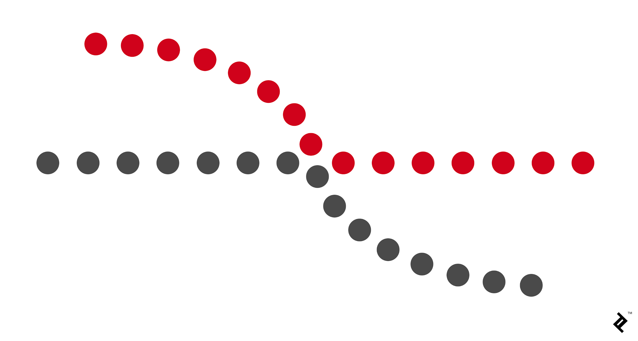
1b. Asymmetrical balanceIt has unequal visual weight on each side of the composition. One side of the composition contains a dominant element, which could be balanced by a couple of lesser focal points on the other side. More dynamic and interesting. It evokes feelings of modernism, movement, energy, and vitality.  Figure 1.2 Example of Asymmetrical Balance2. EmphasisEmphasis is used to create dominance and focus in design work. Various elements can be used to create emphasis, such as color, shapes, or value, to achieve dominance.

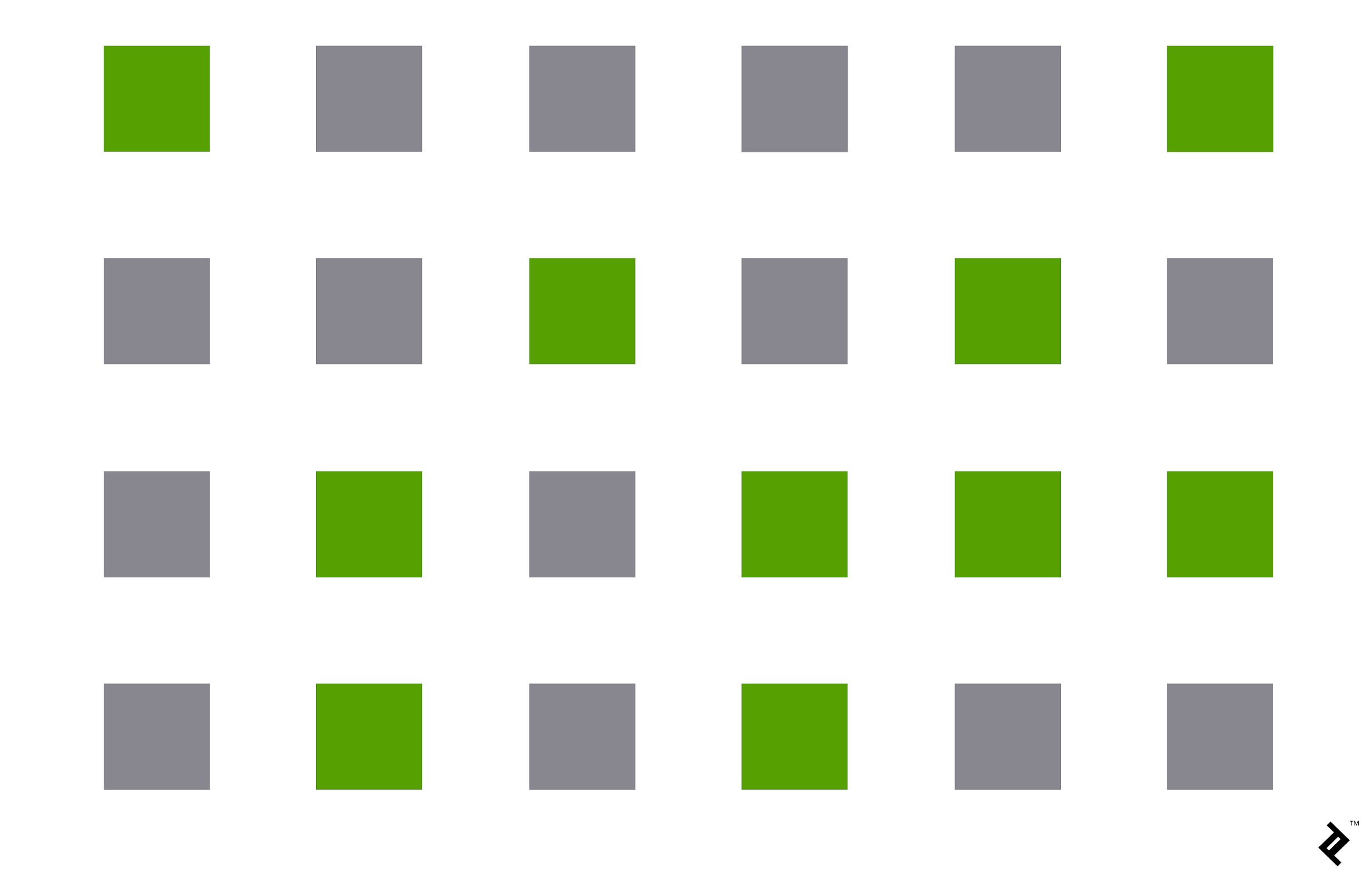
Figure 2.1 Example of Emphasis
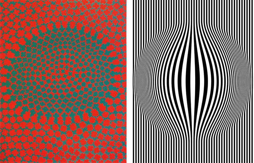
3. RepetitionRepetition can make a design work seem active. The repetition of elements of design creates rhythm and pattern within the work. Variety is essential to keep rhythms exciting and alive, and to avoid monotony. Pattern increases visual excitement by enriching surface interest.
 Figure 3.1 Example of Repetition
4. MovementThe way a design leads the eye in, around, and through a composition - the path the eye follows. Motion or movement in a visual occurs when objects seem to be moving in a visual image. Movement in a visual image comes from the kinds of shapes, forms, lines, and curves that are used.
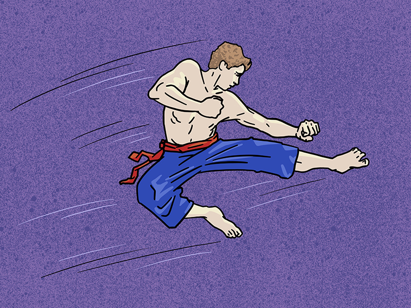 Figure 4.1 Example of Movement
EXERCISE 2: Choose TWO principles from Emphasis
/ Balance / Repetition / Movement. Produce 1 design for each chosen
principle.
VISUAL RESEARCHI looked for inspirations for Repetition, Emphasis, and Balance to keep my options open.

 Figure 5.1: Inspiration for Repetition
I love these works because they are very catchy and reminds me of street fashion.
 Figure 5.2: Inspiration for Emphasis
I think that the quote and typography here are very cute.
 Figure 5.3: Inspiration for Balance
I love these 2 snowmen from Sia's music video 'Snowman'. They are so adorable and have a deep meaning to them. The theme makes me look forward to Christmas that is coming in a few months.
IDEA EXPLORATION AND DESCRIPTION 1 Figure 6.1: Repetition Draft
REPETITION: Anxiety is the theme for repetition. It is something that I am experiencing and learning how to overcome. Anxiety can make a person restless and tense. It is can also make someone feel like they cannot stop worrying. For example, worrying about anxiety itself or worrying that people are angry or upset with you.
I repeated the words “anxiety” in a column showing how a person with anxiety can worry about them having the mental illness itself. The texts are broken into pieces to convey how the sickness can make the person feel unstable and unconfident. The word “anxiety" is also placed in the center as it is the primary cause. Because a person with anxiety always worries about things, therefore the word in the center is very wavy and out of place.
 Figure 6.2: Emphasis Draft
EMPHASIS: It is true: laughter is the best medicine. Laughter strengthens your immune system, boosts mood, diminishes pain, and protects you from the damaging effects of stress. In line with the concept, I drew the quote “Life is better when you are laughing” with an emphasis on the text “laughing”. I replaced the letter "U" with a happy mouth, and I drew lines coming from the other alphabets to convey movement from giggling. It is like the text is laughing.


BALANCE (APPROXIMATE SYMMETRY): I drew 2 snowmen because I rarely see people building 2 snowmen together or in cartoons or posters. I think the snowman is lonely if it were by itself, so I drew him a friend. To show balance, I sketched both snowmen to be the same shape and size beside each other, but with different accessories.
FEEDBACK FROM LECTURER 1Ms. Jinchi thinks that the repetition design is interesting and said I could proceed to finalize the design. For the emphasis design, too many things are going on in this piece. No one element stands out, which is what emphasis is. Lastly, for the design on balance, Ms. Jinchi advised me to add borders such as mistletoe or snow to complete the artwork.
IDEA EXPLORATION AND DESCRIPTION 2
Figure 7.1: Repetition Final OutcomeI created this artwork using Adobe Photoshop and it represents what people with anxiety feel: overthinking and unstable mental state.
 Figure 7.2: Balance Final OutcomeI created this artwork using Adobe Illustrator and I think it would be great to create two snowmen best friends. I was looking forward to Christmas during the time of brainstorming even though it was still far away.
FINAL OUTCOME AND BRIEF RATIONALE (REPETITION)
Anxiety is a mental illness that is common nowadays. Although there is no exact answer as to why anxiety is so common, many attributes this presumed increase in anxiety disorders to social media, poor sleep habits, and underreporting in the past. With this design work, I hope that people with anxiety will feel less alone knowing that others are going through the same process and that we can overcome this obstacle together.
To display repetition, I repeated the word “anxiety” in a column and broke them down into fragments, signifying the feeling of difficulty concentrating, which is one of the symptoms. The text “anxiety” in the center is in red and super wavy, which also shows anxiousness. When someone is feeling anxious, their body reacts with effects such as a racing pulse, sweaty palms, and shaky hands.
FINAL OUTCOME AND BRIEF RATIONALE (BALANCE)
I drew the two snowmen because usually we always see one snowman only, whether on television or posters, so I wanted to give him a friend. I also missed traveling after staying home for so long during the COVID-19 pandemic, so I drew them both having fun outside in the snow. Moreover, I am looking forward to Christmas even though it is still months away, so that's why the Christmas theme. To display Balance (approximate symmetry), both snowmen have the same shape except that they are reflected, and have their own unique accessories.
FEEDBACK FROM LECTURER 2Ms. Jinchi said that my finishing for repetition is neat and looks professionally finished. Same with Balance too. She also said good job!
REFLECTIONFor exercise 2’s work, I was able to complete it faster than the previous one. Although it took me some time before finalizing the design, I produced fewer drafts than exercise 1. I also felt more focused and not drawing just for the sake of the showcasing principle. When designing exercise 2, I tried moving to different places in my house to sketch the designs to get better inspiration and a refreshing environment, especially in areas with fresh air and enough sunlight. After drawing for a few days, I finally settled on the drafted designs.
I think my designs look nice, especially the repetition one, because it resonates with how I feel and what I went through. It is like pouring my experiences into a design. As for the balance one, I feel happy and sad with the artwork because it looks cute, but I wish I could be like the snowmen having fun outside (without wearing a mask).
I am looking forward to my next exercise to see what I can come up with next!

----------------------------------------------------------------------------------------------------------------------------
💬 Week 1-2 [23.08.2021 - 05.09.2021]: Gestalt & Contrast
RECAP OF LECTURES
ELEMENTS OF DESIGN:
 #5 FIGURE-GROUNDThe figure/ground principle is similar to the closure principle in that it takes advantage of the way the brain processes negative space. Your brain will distinguish between the objects it considers to be in the foreground of an image (the figure, or focal point) and the background (the area on which the figures rest).

Figure 2.5: Example of Figure-Ground
EXERCISE 1: Produce 1 design of Gestalt theory & 1 design of Contrast
VISUAL RESEARCHI looked up on Pinterest for some inspiration for my Contrast and Gestalt Art.

Figure 3.1: Inspiration for Contrast
I love the contrasting lines in this image that help distinguish the heart.

Figure 3.2: Inspiration for Contrast
I think this design looks cute with the contrasting colors and the lines that cut through the heart.

Figure 3.3 Inspiration for Gestalt
This is a great gestalt similarity design because it shows a tree growing inside a boy which also looks like a brain. This conveys the growth as a person, which is also what I am currently going through.
IDEA EXPLORATION AND DESCRIPTION 1Then I started on my draft for Contrast and Gestalt:


Figure 4.1 Left: Contrast Draft 1Right: Gestalt Draft 1
CONTRAST: I chose the theme 'Love' because it is very important. Amidst the pandemic, whether it is loving our parents or self-love, these are the things that keep us sane and feel happy. Both hearts in the draft is melting inspired by Olaf from Disney's Frozen quote: "Some people are worth melting for."
- Top Heart: I filled the heart with bright ombre colors to stand out against the black background.
- Bottom Heart: This one is made with straight lines, and curvy lines inside to make it look stand out; claiming its importance.
GESTALT (SIMILARITY): The theme is 'growth' because it is something I am going through currently, which is adulting. - Female Silhouette: The girl represents me.
- Tree and flowers: The blooming represents how I am growing towards the highest point of my life.
FEEDBACK FROM LECTURER 1For the contrast artwork, Ms. Jinchi advised me to show different ways to portray the heart shape. It could be an open composition (only showing a part of it). It could be in different sizes or showing 3 hearts, and some will be black and white. Each can be a different sunset color or a combination of contrast colors like dark blue and orange, complementary colors, or red and white. As for Gestalt, Ms. Jinchi advised me to think of other things to represent growth and confidence. She gave an example which is drawing a bell bar but replacing the dumbbell with ribbons.
IDEA EXPLORATION AND DESCRIPTION 2Afterward, I tried to look for more inspiration for "Gestalt" as I would like to explore more ideas.

Figure 4.2 Inspiration for Gestalt (Continuous)(https://www.pinterest.com/pin/108649409734769578/)
I like this design because the leaf flying across the air in an approximately straight line completes the letter "H".


Figure 4.3[Left]: Contrast Draft 2 [Right]: Gestalt (Continuation) Draft 2
CONTRAST: I stick with the theme 'love' and used red and white colors to create a contrast in colors using Adobe Illustrator. I also applied squares / checkered patterns into the heart to add a variety of shapes to the artwork.
GESTALT (CONTINUATION): I wrote the word "Bee" in dotted lines which represented the bee's path and at the end, there is a bee that flying. So it is like the Bee flew around and wrote the word "Bee" in the air.
FEEDBACK FROM LECTURER 2Ms. Jinchi mentioned that both designs represent the principles. However, she told me to explore more.
IDEA EXPLORATION AND DESCRIPTION 3

 Figure 4.4: More Contrast Inspirations
I like the colors here as they are very catchy.
 Figure 4.5: Contrast Draft 3
Following the references I had, I attempted to create a contrasting pop art design with the checkered heart design that I made
 Figure 4.6: Contrast Final OutcomeI chose to go with the red one because the yellow and orange background ones did not look contrasting enough. I also prefer the colour combination of red, white and black compared to the combination of blue pink, and yellow.
 Figure 4.7: More Gestalt (Figure-ground) Inspiration
I decided to switch up my Gestalt theme idea because I felt that I was going through a dead end with my previous draft and there wasn't enough depth to it. Whereas this new idea is something that I do care about as it is related to our health. Smoking is unhealthy for our body and is worse when it risks the wellbeing of the passive smoker as well. This artwork will help raise awareness on the consequence of smoking: death.

Figure 4.8: Gestalt (Figure-ground) Draft 3


 Figure 4.9 Gestalt (Figure-ground) Draft 4
I experimented with different color palettes for the design I drew on Adobe Illustrator and chose the third one for my final one.
 Figure 5.1 Gestalt (Figure-ground) Final Outcome
FEEDBACK FROM LECTURER 3For Contrast, Ms. Jinchi said the ones with blue and red backgrounds in Figure 4.5 are fine but the yellow and orange backgrounds did not show much contrast. She told me to pick between the red or blue background heart for my final design. For Gestalt, said she gets the idea of Gestalt (Figure-Ground) in the artwork and the finishing is neat and looks professionally finished.
FINAL DESIGN OUTCOME WITH BRIEF RATIONALE (CONTRAST)
I chose the theme 'Love' because not only is it crucial to our well-being, but it also has always been there in our lives entire life since birth. From parents and relatives who love us to stories that taught us about love. In the renowned novel & movie series Harry Potter, it was Harry Potter's mother’s love that gave him protection from evil spells from the villain, Voldemort, who did have an inch of love in his soul. Self-love is the love we give to ourselves, to care for us when we are at our lowest and highest, the thing that taught others how to love you. Thus, it has a deep meaning and reason why I chose it for my Contrast design.
To show contrast, I used red to signify love and combined white and black to make the colors pop. The checkered pattern provides a contrasting shape from the heart, and it has the look of street fashion design.
FINAL DESIGN OUTCOME WITH BRIEF RATIONALE (GESTALT: FIGURE-GROUND)
Smoking is a habit done by many. There are many campaigns to raise awareness of its dangers as it is the cause of many cases of lung cancer. COVID-19 pandemic is also a widespread virus that causes damage to our lungs. If a smoker already suffers from premature death from smoking, it would be even more dangerous if the person gets infected with COVID-19 as it may escalate lung damage even further.
Therefore, this design serves as a warning to the general public to prevent and stop smoking. The somber color palette signifies a tragic end if the person doesn’t stop smoking. To show the Gestalt principle, I incorporated figure-ground in my work. The smoke is the figure, whereas the skull is the ground.


- Top Heart: I filled the heart with bright ombre colors to stand out against the black background.
- Bottom Heart: This one is made with straight lines, and curvy lines inside to make it look stand out; claiming its importance.
- Female Silhouette: The girl represents me.
- Tree and flowers: The blooming represents how I am growing towards the highest point of my life.


.png)

Comments
Post a Comment